top of page
Jordan Gozinsky
Sum't Up
Sum't Up is a Chrome extension that provides readers with instant, AI-powered article summaries tailored to their reading style and time

Overview
Sum't Up empowers users to engage with online content more efficiently by leveraging AI to generate concise article summaries and facilitate interactive, article-specific conversations. Whether someone is conducting research, staying updated on news or casually browsing, Sum't Up helps users save time and get to the core of the content instantly.
Unlike traditional summarizers, this extension goes a step further by integrating a built-in chat feature. Users can ask follow-up questions about the article—like clarifying a complex section or exploring the author’s argument—and receive context-aware answers in real time.
Goal
The primary goal of Sum't Up is to empower users to quickly and easily digest online articles by providing AI-generated summaries that can be customized in format, length and tone to suit their individual preferences. Additionally, the extension includes a conversational chat feature that allows users to ask questions related to the article for deeper understanding. Overall, the extension strives to enhance the online reading experience by making it more efficient, personalized and interactive without disrupting the natural reading flow.
Day One: Mapping
I began the design sprint by reviewing user research gathered from interviews with students, researchers, and professionals who frequently engage with long-form online content. This research included transcripts, user quotes and personas that revealed a common need for tools that save time and enhance comprehension. From these insights, I created a user journey map focused on a single experience: a user opening the extension, selecting summary preferences, generating a summary and using the chat feature to clarify article content—establishing a clear, user-driven foundation for the extension’s design.

Day Two: Secondary Research & Sketching
Secondary Research
Day two focused on secondary research and competitive analysis. I conducted lightning demos to explore how other tools approach similar challenges in content summarization and user customization. I analyzed several browser extensions and AI-driven platforms to evaluate how they handle content personalization, interface design and user interaction
One of the key influences during the research phase was AI Summarizer by ReadPartner, a Chrome extension that combines straightforward summarization functionality with a user-friendly interface. What stood out was its ability to deliver concise, digestible summaries without overwhelming the user—something I aimed to emulate in my own design. While it doesn't offer extensive customization, its clarity and simplicity informed my approach to summary presentation. Additionally, it reaffirmed the value of having a lightweight tool that supports comprehension without disrupting the natural flow of reading.


Another valuable reference during my competitive analysis was Article Summarizer, a tool that not only generates concise summaries of web content but also integrates a contextual chat feature. This dual-functionality approach closely aligned with the core objectives of Sum't Up—offering users both a quick overview and the ability to ask follow-up questions for deeper understanding. Observing how Article Summarizer combined summarization and interactive support helped validate my decision to prioritize a similar experience, ensuring users could stay engaged and informed without leaving the article.
Sketching
After completing my secondary research, I transitioned into rapid ideation using the Crazy 8s method—a fast-paced sketching exercise that pushes designers to generate eight unique interface ideas in eight minutes. I began by identifying the most critical screen in the user journey: the in-article overlay where users access both summary controls and the chat feature. This screen was a focal point because it represents the core functionality of the extension—helping users quickly understand content and engage with it interactively without disrupting their reading flow.
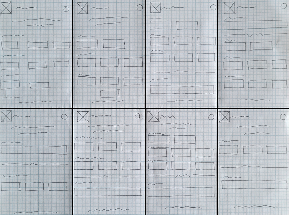
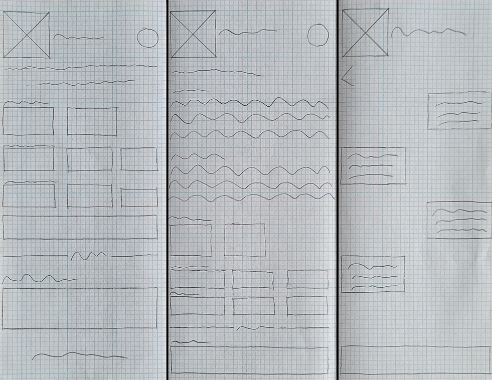
Once the Crazy 8s sketching session was complete, I carefully reviewed each concept to determine which design best supported the core functionality of the extension. After evaluating the options against user needs and journey goals, I selected the strongest direction and developed it further into a solution sketch. This sketch acted as a mini-storyboard, capturing the key moments of the user flow: starting from the homepage, moving into the summary of an article and ending on the chat feature where users can ask article related question and have them answered by the extension.
Day Three: Storyboards
On the third day of the design sprint, my focus shifted to building a virtual storyboard that would guide prototype development on day four. Rather than mapping out every possible interaction within the extension, the storyboard concentrated on the most essential steps a user takes when engaging with its core features—customizing a summary and using the chat. This process helped clarify the user journey, revealed opportunities for improvement in the earlier sketches and ensured the experience remained intuitive, purposeful and aligned with user expectations.
1.

-
Users open the extension and adjust the summary settings
2.

-
Users have the ability to adjust additional settings for their summary
3.
-
Users ask Sum't Up's AI chatbot questions related to the article
4a.

-
Users receive the article's summary presented in a concise, easy-to-read paragraphed format designed to enhance scannability and comprehension
4b.

-
Users receive the article's summary presented in a concise, easy-to-read bulleted format designed to enhance scannability and comprehension
Day Four: Prototyping
One of the most challenging moments of the design sprint came on day four, when it was time to begin prototyping in preparation for user testing. As the sole designer on the project, I was responsible for bringing the entire experience to life—designing each screen, refining interactions and ensuring that every detail aligned with the user journey. Balancing speed with precision was demanding, but it allowed me to translate ideas from sketches and storyboards into a fully interactive prototype ready for testing.
Given that the extension is designed to help users quickly understand online content, I prioritized a clean, efficient interface that minimizes unnecessary steps. The goal was to save users time by making features like summary customization and the chat function immediately accessible—without hidden menus or confusing navigation. By using clear button labels and displaying all options upfront, users can generate summaries or ask questions with minimal effort, allowing them to get the information they need faster and continue browsing without disruption.


Day Five: User Testing & Design Updates
The design sprint concluded on day five with usability testing and iterative updates. I conducted five user interviews with participants aged twenty-five to forty, including professionals and graduate students who frequently read online for work or research.
Notable results of the tests included:
-
All users indicated a desire for improved clarity and distinction between sections
-
Three users noted that the settings icon was too small for comfortable use
After completing the tests, I thoroughly analyzed the results and used the insights to guide updates to the existing designs.

Updates:
-
Increased the size of the settings icon to enhance visibility and improve accessibility, ensuring users can easily locate and interact with the feature across various screen sizes

Updates:
-
Increased the spacing between sections and added a visual divider to improve content separation and enhance overall readability
Conclusion
This design sprint proved to be highly effective. In just five days—covering research, journey mapping, sketching, storyboarding, prototyping and user testing—I was able to advance from initial insights to high-fidelity mockups that successfully met the goals established for the Chrome extension.
As with any design project, there were both challenges and successes. A significant challenge in this sprint was the lack of successful competitors to analyze. Because few tools offered a similar combination of customizable AI summaries and interactive chat features, it was difficult to find direct examples to benchmark against. This required me to broaden my research scope and draw insights from related but less comparable products. Despite this, the research phase provided valuable inspiration that informed the design decisions throughout the sprint.
Fortunately, not every aspect of the design sprint presented challenges. During user research, I was able to quickly and easily recruit participants who fit the target profile for interviews, providing valuable insights that directly informed the design process. Additionally, practicing the Crazy 8s sketching method helped me enhance my rapid ideation skills. This exercise of generating eight distinct sketches in eight minutes accelerated my brainstorming and reinforced the idea that exploring multiple concepts often leads to the most effective design solutions.
Overall, this design sprint was a highly valuable learning experience that helped me sharpen many of my design skills. I look forward to applying these insights in future sprints and continuing to create exceptional user experiences.
Please feel free to contact me if you would like to collaborate
Phone
631-645-9940
bottom of page