JG
Javori Designs
Where Craftsmanship Meets Connection

Casting On: Overview
Javori Designs is a creative knitwear brand offering an exclusive collection of stylish knitting patterns, as well as handcrafted clothing and accessories. Led by the talented designer Andi Javori, the company specializes in unique, high-quality garments and accessories that blend traditional craftsmanship with contemporary design. Javori Designs also provides a diverse range of downloadable knitting patterns, making it accessible for knitters of all skill levels, from beginners to seasoned experts, to craft beautiful, custom pieces.
Choosing the Yarn: Goal
The mission was to revamp the user interfaces of Javori Designs' high-traffic pages, giving the site a modern, polished look that stands out among competitors. The redesign included adding a blog and interactive features, creating fresh ways for users to engage with Andi Javori and connect with one another. The goal was a sophisticated aesthetic aligned with design trends while fostering a more dynamic, user-friendly website that encourages visitors to linger, explore, and build stronger community ties.

Pulling the Threads: Research
To understand Javori Designs’ users and their needs, I began by conducting surveys and interviews. An online survey was shared through the company newsletter, gathering responses over several days and revealing key pain points, most notably a desire for a stronger sense of community and better access to product reviews. To deepen these insights, I conducted five remote interviews using thirteen open-ended questions focused on participants’ backgrounds, experiences, and preferred online communication methods. Together, these research methods provided a well-rounded understanding of user expectations and laid the foundation for the design decisions that followed.
"For me knitting is a social activity. I love to share my current and upcoming projects with others whenever I can."
-Barbara M, Javori Designs Customer
"Many of the designer websites I come across don’t really build a sense of community. A lot of them feel like they’re only focused on promoting new projects and making sales."
-Jessica L, Javori Designs Customer
"I’ve been knitting for over thirty years and have interacted with many different brands. When I engage with a brand, whether it makes knitting needles, yarn or both, I appreciate when it tells a story."
-Nancy R, Javori Designs Customer
"Product details are very important to me, especially when it comes to buying clothing. I want to know every measurement possible so I don't have to deal with organizing returns."
-Anna B, Potential Javori Designs Customer
Knitting Characters: Personas
From the interviews, I crafted two personas in Miro that represented the broader user base. These personas captured behaviors, goals, and needs, serving as ongoing references to ensure design decisions remained user-focused throughout the project.


Mapping the Pattern: User Journeys
I created user journey maps in Miro to visualize how users would interact with the site, especially around connecting with other users and accessing product reviews. Mapping these steps revealed missing features, like the ability to report inappropriate comments. Integrating these functionalities helped create a more complete, engaging user experience.
Flow #1: Viewing Blog Posts

Flow #2: Purchasing a Product

Sketching the Stitches: Sketches
The design process began with hand-drawn sketches shaped by insights gathered from surveys, interviews, and user personas. These early sketches established a foundation for the design direction that followed. As the concepts were reviewed, it became clear that some elements were unnecessary. For example, page titles were removed because the menu already provided clear context for the user’s location on the site. Throughout the remainder of the design process, these sketches served as a reference point, helping ensure that the issues identified during research were addressed and resolved in the final design.
Homepage

Blog

Store Homepage

Product Page

Comments and Product Reviews

Setting the Needles: Low-Fidelity Wireframes
Using Figma, I translated the initial sketches into low-fidelity wireframes. These wireframes were reviewed and approved by my client and her team before moving forward. Once approved, they were used for user testing to evaluate the layout and functionality of the design. After three rounds of testing, I incorporated the feedback gathered from participants into the development of the high-fidelity mockups.

The Pattern Comes Together: High-Fidelity Mockups
In Figma, the low-fidelity wireframes were refined into high-fidelity mockups. During user testing, participants suggested updates that would give the interface a more modern and polished look. This feedback played an important role in shaping the final visual design reflected in the mockups.

Testing the Stitches: Usability Testing
Throughout the development of the high-fidelity mockups, potential users were recruited to participate in usability testing. The first round included three participants and took place over two days. Feedback gathered during this phase was used to refine the design. After these adjustments were implemented, a second round of testing was conducted with three additional participants to evaluate the effectiveness of the updates and determine whether the issues identified in the first round had been successfully addressed.
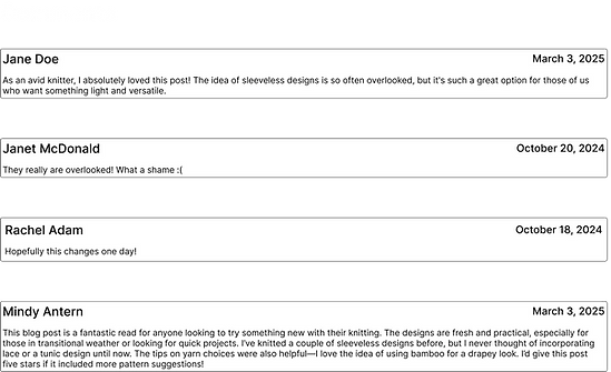
Issue: Restrictions on product reviews and comments
Findings: One of the key insights from usability testing was that the intended sense of community was not fully realized. In the initial design, users could only submit a product review or comment on a blog post. During the first round of testing, two of the three participants suggested that allowing users to reply to other comments and product reviews would encourage more discussion. Without this feature, both participants expressed frustration and emphasized its importance for fostering meaningful interaction between users.
Solution: After reviewing the feedback, the comment and product review sections were redesigned to allow users to respond directly to other comments and reviews. To further support positive community interaction, a feature was also added that allows users to report inappropriate comments. The updated design was then evaluated in a second round of usability testing, where participants responded positively and expressed satisfaction with the improvements.
No ability to add a comment to an already existing comment
Ability to comment on other user's comments was added to enhance the opportunity for discussion

Threads of Insight
Collaborating with Javori Designs was a valuable experience that deepened my understanding of the UX design process. One of the most important takeaways was the value of maintaining close communication with the client throughout each stage of the project. By keeping an open dialogue and regularly sharing progress, I was able to ensure that the final design aligned closely with my client’s vision while also addressing the needs of the users.


Future Knots: Next Steps
Design is an ongoing process, as user needs and technology are constantly evolving. After a website or application is launched, user feedback provides valuable insights that can guide future improvements. For Javori Designs, there are several features that could further enhance the user experience.
For example, adding a “verified buyer” icon to product reviews would help users trust that the feedback they’re reading comes from informed experiences. Additionally, user interviews suggested a search bar to locate keywords within blog post comments. While these features were not part of the initial release, they remain strong candidates for future updates.